
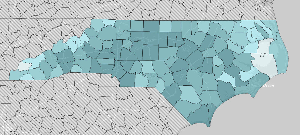
With the election of 2020 finished, the division of our country into two tribes is complete. One way to observe this transition is to inspect the voting patterns of local districts with the party votes separated. In particular, consider the voting patterns in North Carolina.
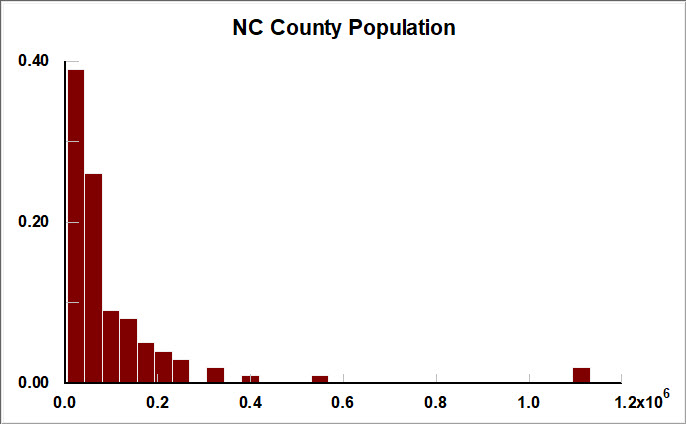
North Carolina has a total projected population in 2019 (prior to the census) of 10,488,084. The state is divided into 100 counties with sizes ranging from 4,260 to 1,131,142. The geography ranges from the coastal Outer Banks, thru the sandhills, on into the mountains in the west.
The cities of Charlotte in Mecklenburg County and Raleigh in Wake County stand out from the distribution of population in the other counties. Greensboro in Guilford County is not far behind. However most of the counties are small, with a median of 56,000 residents.
Voter registration in North Carolina is variable. The larger counties, reflecting their cities, have about 70% of the population registered, about 91-93% of persons once children have been subtracted. Mecklenburg: 0.700, Wake: 0.716, Guilford: 0.718.
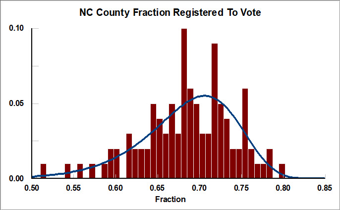
If the high fraction of registered voters in the cities seems odd, perhaps the system of culling old registrations is not working. This situation is highlighted by the number of foreign born people in each [city] county. Mecklenburg: 10.0%, Wake 13 %, Guilford: 10.2%.
Those counties with the lowest registration have less commonality. Many contain military bases, or are located near enough to provide off base housing. Military personnel can specify a different ‘legal residence’. And some counties are rural with higher poverty.
With the preliminaries done, the voting patterns can be split by political party. Democrats hold the edge in registration with 2,623,000 (35.6%). Unaffiliated voters are next with 2,452,000 (33.3%), with Republicans third with 2,231,586 (30.3%). Minor parties make up the rest.
Interpreting the demographic patterns in voting is fraught with misinterpretation because the ambiguity of weight of recent events as well as long or short term self-interest. With that caveat, the obvious demographic patterns are mentioned.
North Carolina had an election for the United States Senate this year: Thom Tillis (R) vs Cal Cunningham (D). Coupled with Presidential election of Donald Trump (R) vs Joe Biden (D), we can look at the ratio of votes with each party as a function of county: President/Senate.
This statistic uses the ratio of county votes because county results scale by geography rather than population. Such scaling emphasizes minority positions in exactly the same manner that the US Senate does for the country. Please remember that both Trump and Tillis won the state.
The ratio statistic for the Republican Party has three characteristics. First, Trump was more popular than Tillis which may reflect the position of unaffiliated voters. Second, the ratio is skewed to the left indicating greater variation in the voting for the National candidate than the State candidate.
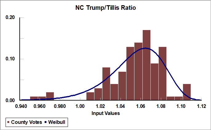
Third, several counties are in the left tail of the distribution: Wake (0.973), Orange (0.967), Mecklenburg (0.960), Durham (0.950). Notably these counties are also home to the universities of NC State, UNC Chapel Hill, UNC Charlotte, and Duke.
Remember that this is only the Republican part of the vote. Perhaps those voters feel localized pressure from the larger Democratic majorities in their counties, especially the university progressives. Democrats hold a voting advantage of 1.7X in Wake to 4.5X in Durham.
The difference between counties with large universities and the smaller counties is more obvious if the ratio of the Trump/Tillis vote is plotted against the population in each county. The former counties cluster on the left side of the plot where Trump is less popular.
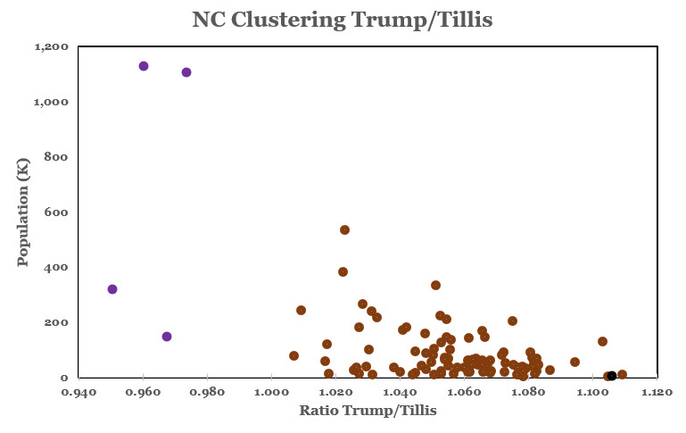
This plot shows the difference between population scaling and geographical scaling. How does this disparity of opinion within the Republican Party of North Carolina get represented in the news media whose offices are clustered in the cities?
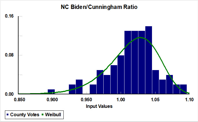
The ratio statistic for the Democratic Party is also skewed to the left, but with a longer tail. More counties withdrew support for Biden relative to the vote for Cunningham. Moreover the mean value of the ratio is closer to one than the comparable Republican ratios.
Many of the counties in the left tail are small, predominately white, and in the northwest rolling hills to Blue Ridge Mountains: Alleghany, Mitchell, Stokes, Surry, Wilkes, Yadkin, Yancy. This is the mountain home region of North Carolina, with good hunting and fishing.
Perhaps this voting drift is a response to the racial identification typical of the national Democratic Party. If so, this is likely the tip of the iceberg that remains hidden in the other larger and more diverse counties. And it could also be a religious response.
But, from other sources, these are hardworking people who believe that all should work for a living, and do not take kindly to those asking for handouts. Perhaps that is the difference that the National Democratic Party has neglected.
Remember, these electors voted for Cunningham, but not for Biden. Are they Democrats who crossed for Trump, or Republicans who crossed for Cunningham, or Unaffiliated, or vote abstainers? This county cluster provides a good example of the difficulty of reading cause from pattern.
Davidson and Randolph are two counties where Biden also did poorly among Democratic voters. Perhaps those voters feel localized pressure from the larger Republican majorities in their counties. Republicans hold a voting advantage of 2.9X in Davidson to 3.6X in Randolph.
And the two counties at the outer banks, Hyde and Tyrell, also voted poorly for Biden vs Cunningham. Both counties were still recovering from Dorian. Their tourism economies prospered after reopening. And the military has a presence.
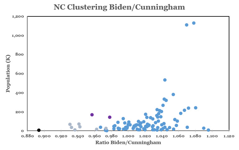
The long tail of dissatisfaction with Biden among the smaller counties of North Carolina relative to the cities is more visible with a plot of the ratio vs the population. The counties with large cities were in favor of both candidates; the smaller counties were dispersed.
This plot shows the difference between population scaling and geographical scaling. How does this disparity of opinion within the Democratic Party of North Carolina get represented in the news media whose offices are clustered in the cities?
Which brings the story to Graham County where Republicans voted strongly for Trump and Democrats, very weakly for Biden relative to their respective US Senate candidates. What happened there? Perhaps the BLM complaint about a deputy sheriff’s comments made a difference.
References
- https://ncosbm.opendatasoft.com/pages/nc-complete-count-committee/
- https://www.grahamstar.com/local-regional-news/deputy-reprimanded-online-post